Responsive website design and development services by 610 Web Lab
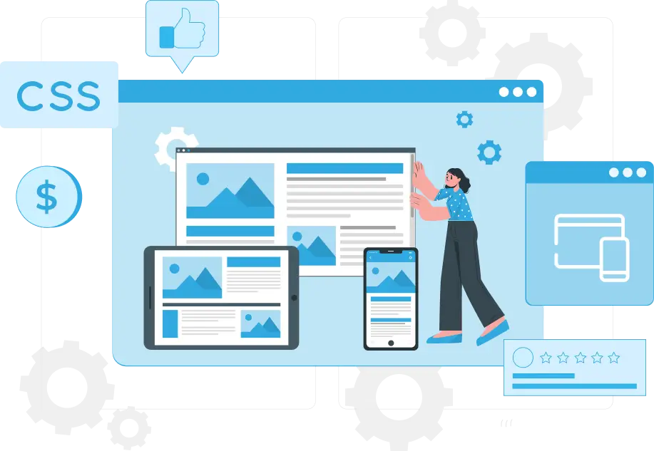
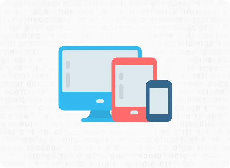
We create websites that look good on every screen across each and every device. If you are looking to increase conversion rate and top of the Google Search then, all you need is a responsive website with web content adapted to the different screen.
Technologies used to create a responsive website design

HTML
CSS

Media Queries
HTML
HTML is one of the two main languages that define the structure, elements, and content of a webpage. HTML code holds the content and images of your website and provides a base to a webpage.

CSS
CSS is the second most important programming language that provides shape to a webpage. CSS is responsible for the styling and layout of a webpage. CSS is used to represent the elements in a more arranged manner.
Media Queries
These are the fundamental part of CSS which are used to declare the screen size to render across different devices.
Advantages of having a responsive website
Great page experience across devices
Responsive websites provide a great user experience to every visitor whether he is browsing the website on desktop, on mobile or any other device. He gets a website that perfectly fits the screen size of the device he is using.
1
Search Engine Friendly
Google rolls out many algorithms to decide the ranks of the website fighting to be on top. Mobile responsiveness is one of the major factors considered by Google and many other search engines to rank a website. So you have to leverage that advantage by choosing a responsive website design.
2
Increase conversion rate
When your website delivers a good user experience across different devices then it automatically increases the chances of getting your visitors converted into leads.
3
Get Every Update
Read Latest News Blogs

29 August, 2024
eCommerce Business: Achieve Your Goals Faster and build a skyrocket eCommerce Business
Are you looking to take your eCommerce Business to new heights and achieve your goals in record time? Building a...
31 March, 2022
Laravel vs WordPress – 7 most Valuable differences which may concern you
In this guide, we will list all the possible points of difference between Laravel and WordPress. And we will try...
27 January, 2022
Wix vs. WordPress – A detailed comparison to help you select the best out of the two
Wix vs. WordPress is a difficult part of the discussion since both of the platforms have their own pros and...
we are trusted by
1000+ clients worldwide


contact us
Get in Touch with our Skilled Tech Team

Address
C-196/A, Times Square Building,
Opposite to Hindustan Times, Phase-8B
Industrial Area Mohali
Opposite to Hindustan Times, Phase-8B
Industrial Area Mohali

Email Address

Office Hours
Mon - Fri: 9.00am to 6.00pm
Sat-Sun: Closed
Sat-Sun: Closed